More Than a Simple Find/Replace Operation: Changing CREDIT to Kredit
October 26, 2011
By Dave Weber, KF16 Cambodia
Corporate logo changes are common. It’s rare to find a company that has maintained their corporate logo since opening their business. Corporate name changes, however, are more rare. In 2011 CREDIT in Cambodia is in the process of changing both.
I promised myself that I would only show a couple examples of corporate logo changes, but these were too interesting to not share with our loyal Kiva blog subscribers.
Apple went from (1) a frontier Isaac Newton phase to (2) a “more gay rights for the bay area” phase to (3) a “our corporate logo should be the same color as all of Steve Jobs’ shirts” phase to finally (4) a slick, chromed-out futuristic astronaut phase.
History lesson: In 1900, Shell engineers (there was no such thing as marketing back then) had a big brainstorming session to come up with an image that had the least amount of resemblance to an actual shell.
Note the removal of serifs from 1971 to 1987. Huge move, Kodak.
It’s interesting how you can date yourself by recognizing some of these logos.
Pepsi must suffer from image-issues with all their logo changes. To be honest, if you showed me their current logo down there, I would not have recognized it as Pepsi. I would have guessed an airline.
Little known fact: Nokia led the market share for cell phones prior to the iPhone back in 1865. Their mobile phones might not have had integrated digital cameras back then, but they did have a very capable flash enabled web-browser so those with a data plan could check cnn.com for streaming video on breaking Civil War updates.
Last one, I promise. Looks like Wal-Mart in 1964 was after the spur-wearing, saloon-frequenting frontiersman market segment.
Did I really just waste that much vertical space on corporate logo images? Hopefully that was enlightening, but probably is was just entertaining.
So, let’s talk about CREDIT, who in 2011 is going through a large name and corporate logo change initiative.
I was able to have a long conversation with Mr. Huang Kim, the director of marketing at CREDIT where he informed me of the need for their change. Since CREDIT has a large network of international partners, it was difficult to differentiate themselves with a name of CREDIT. Their name, while an acronym (Cambodia Rural Economic Development Initiative Transformation), is also a generic banking term referring to lending practices. Some of CREDIT’s borrowing clients also shared difficulties understanding their name. And let’s be honest here, that acronym is out of control. CREDIT considered completely different name changes, but landed on “Kredit Microfinance,” to retain name recognition but differentiate themselves, at least in writing.
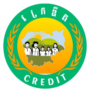
CREDIT’s marketing consultants also suggested new logos. Their previous logo was too complicated to replicate and contained many elements common among their Cambodian competition, like a map of the country, grain, and an emphasis on the color green. All it was missing was a characteristic silhouette of Angkor Wat.
Kredit Microfinance’s new logo has great symbolism behind it. Their corporate mission in 2011 is growth and their new slogan is “supporting you to grow.” Their new logo captures these elements. Kredit is represented as the bottom right 45-degree angled support which is both thick and strong. As most of Kredit’s clients are agrarian, their clients are represented by plants which start out financially weak, but with the financial services of Kredit are able to flourish.
Implementing all of these changes at CREDIT is a large endeavor and requires employees in all departments to take on additional tasks:
- CREDIT’s website needs to incorporate the change
- All their letterhead and e-mail signatures need to be modified
- Forms need to be submitted and approved to Cambodian authorities
- All of CREDIT’s partners and clients need to be made aware of the changes
- All of CREDIT’s current marketing on billboards, radio, leaflets, and tuk-tuks need to be changed
- All of CREDIT’s 40+ branches throughout Cambodia need updated signage, documentation, and forms
I’m happy to see CREDIT making these changes and agree they are for the better. On the Kiva side, we will be starting to edit the content both on Kiva’s lender-facing website (the one you all see) and on their partner-facing website, Partner Administration v2 (PA2). Wiki documents for the review teams and Kiva Fellows program also need to be updated.
Some day, your children will ask you, where were you when CREDIT changed their name and corporate logo? Hopefully your answer will be, “Well, I was in the process of joining their lending team on Kiva.org.”
————
Dave Weber is a 4th year PhD candidate in Information Systems at the W. P. Carey School of Business at Arizona State University. His dissertation topic is on the impact of information and communication technologies on the microfinance industry. He and his wife worked at Woodstock School in the Himalayan foothills of India and have volunteered with NightLight in Bangkok aimed at assisting the victims of sex trafficking. When he is not reading, writing, and researching, Dave enjoys playing basketball and tennis, music, traveling, wreaking havoc on his Harley, and rooting for the pathetic Cincinnati Bengals.
PREVIOUS ARTICLE
Geoff Davis Returns to Kiva's Board of Directors! →NEXT ARTICLE
Downsizing Development: How a Soccer Ball Could Change the World →


